
Showcase Publications:
An HTML5 DIV resized with a Javascript slider illustrating the Javascript action in Opus Pro.
Standard HTML content follows:
The Slider Control uses the Javascript Action (Opus Pro only) to change two variables for the width and height of the Responsive DIV via a JavaScript function in the main HTML of the page. This is purely for showcase purposes and the size of the DIV would usually be set by a script checking the screen size of the device viewing the page.
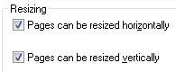
The responsive banner is an Opus Creator HTML5 publication with the Chapter Properties set to be resizable.
It is then published using the Single DIV option and the core Opus HTM is pasted into place in the main HTML - see the responsive content tutorial for further details.
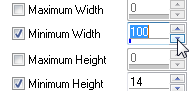
You can set a minimum size for the animation in the Opus Creator Chapter Properties (in this case it has been set to 100px).
If you prefer to use hand-coded HTML, you can manually insert a min-width option for the primary DIV of the animation just as you would with any other content.
Alternatively, you can use JavaScript to make the decision based on screen requirements. In this example we have put a simple checkbox in the Slider component which sets a JavaScript variable and our resizing function limits the size of the DIV if that variable is "on".
This explanation is standard HTML but because it is in a DIV contained within the main responsive DIV it is still resized by the JavaScript slider above. However, because this div is standard HTML and not published from Opus, the content does not scale it has been set to a minimum width of 200 pixels using min-width.
We could have published this content via Opus and then the text itself would have been resizeable but would have quickly become unreadable.